Building responsive websites is already the standard for new websites and relaunches. But delivering a 4k hires image to a mobile device via a 3G or even Edge connection is a pain (especially for the user). The question is: How to avoid this? And how to make visitors and customers happy?
In order to solve this, I found 3 + 1 different approaches. One of them is implemented in the TYPO3 core. Two are standalone solutions which integrate nicely with TYPO3. The fourth solution does the cropping in the frontend and sets an individual viewport.
The browser support for responsive images is getting better and better. On the website „caniuse.com“ you can check which browsers support it currently. If a major browser does not support it, a javascript library must be included which provides the functionality. A good solution is the library of Scott Jehl. It support „srcset“ and the picture element. It’s available via github (http://scottjehl.github.io/picturefill/ and https://github.com/scottjehl/picturefill/)
So let’s start with the TYPO3 integrated solution.
Native TYPO3 Responsive Images Support
Since TYPO3 6.2 the TYPO3 core is able to deliver responsive images. You need only two steps to activate it:
- Enable responsive images in the backend
- Provide a configuration
Enable Responsive Images
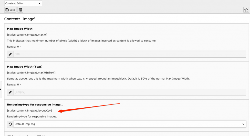
This is achieved through the Constant Editor or via the TypoScript setup. The property is „layoutKey“ and belongs to the cObject „IMAGE“. It defines how the image is rendered.

There are four options available:
- default
- srcset
- data and
- picture.
The value „default” sets the plain old image rendering. This is also the factory setting of TYPO3. „srcset“ and „data“ render the img-tag with alternate sources as srcset or data attributes. „picture“ uses the html picture element with source child tags. Examples of the output are shown in the following code snippets.
<img alt="TYPO3 Responsive Image"
   src="small-picture.png"
   srcset="large-picture.png 1280w, large-picture.png 780w 1.95x, medium-picture.png 780w, medium-picture.png 400w 1.95x">
<img alt="TYPO3 Responsive Image"
   src="small-picture.png"
   data-large="large-picture.png"
   data-large-1.95x="large-picture.png"
   data-medium="medium-picture.png"
   data-medium-1.95x="large-picture.png">
<picture alt="TYPO3 Responsive Image">
   <source src="large-picture.png" media="(min-width:1280px), (min-resolution: 136dpi) and (min-width:780px)">
   <source src="medium-picture.png" media="(min-width:640px), (min-resolution: 136dpi) and (min-width:400px)">
   <source src="small.jpg">
   <!-- fallback -->
   <img src="small.jpg" alt=„TYPO3 Responsive Image">
</picture>
As with any other TypoScript settings, the constants can be overwritten by TypoScript setup. For normal content elements the defintition is done in TypoScript setup section of tt_content.
tt_content.image.20.1.layoutKey = srcset
If you want to use responsive images on IMAGE cObjects in your TypoScript, you must set this and all the following values there as well.
Configuring Responsive Images
To provide an overview, here is a complete codeblock. The properties will be explained afterwards.
tt_content.image.20.1{
   layoutKey = srcset
   layout {
      default {
         element = <img src="###SRC###" width="###WIDTH###" height="###HEIGHT###" ###PARAMS### ###ALTPARAMS### ###BORDER### ###SELFCLOSINGTAGSLASH###>
      }
      srcset {
         element = <img src="###SRC###" srcset="###SOURCECOLLECTION###" ###PARAMS### ###ALTPARAMS### ###SELFCLOSINGTAGSLASH###>
         source = |*|###SRC### ###SRCSETCANDIDATE###,|*|###SRC### ###SRCSETCANDIDATE###
      }
      picture {
         element = <picture> ###SOURCECOLLECTION### <img src="###SRC###" ###PARAMS### ###ALTPARAMS### ###SELFCLOSINGTAGSLASH###></picture>
         source = <source srcset="###SRC###" media="###MEDIAQUERY###" ###SELFCLOSINGTAGSLASH###>
      }
      data {
         element = <img src="###SRC###" ###SOURCECOLLECTION### ###PARAMS### ###ALTPARAMS### ###SELFCLOSINGTAGSLASH###>
         source = data-###DATAKEY###="###SRC###"
      }
      yourCustomRendering {
         element = //your element definition
         source = // your source definition
      }
   }
}
In the section “layout“ all rendering definitions are collected. The layout is a normal TypoScript array. At least the configuration for the selected “layoutKey” must be available. If you want to use „yourCustomRendering“, the same value must be set as the “layoutKey”
The property „element“ is a string and defines how the overall HTML markup for the image is rendered. The avalailable markers and their meaning are listed in the TypoScript documentation. For details have a look here: https://docs.typo3.org/typo3cms/TyposcriptReference/ContentObjects/Image/Index.html#layout-layoutkey-element
The property „source“ defines how a section for a specific viewport is rendered. „source“ is of type „stdWrap”, so the complete flexibility of stdWrap is available here. Also many markers are available, that are known from the classical image rendering. Details can also be found in the TypoScript documentation: https://docs.typo3.org/typo3cms/TyposcriptReference/ContentObjects/Image/Index.html#layout-layoutkey-source
Just in case you are asking yourself what kind of syntax is used in the property „source“ of the „srcset“. It is a so called „optionSplit“. Details are available in the TypoScript documentation:https://docs.typo3.org/typo3cms/TyposcriptReference/ObjectsAndProperties/Index.html?highlight=optionsplit#optionsplit
All sources are concatenated and replace the marker „###SOURCECOLLECTION###“ in the property „element“. The sources are defined in the array “sourceCollection”.
tt_content.image.20.1 {
   sourceCollection {
      small {
         // […]
      }
      medium {
         width = 400
         height = 300
         maxW = 400
         maxH = 300
         minW = 400
         minH = 300
         quality = 90
         pixelDensity = 1
         srcsetCandidate = 800w
         mediaQuery = (min-device-width: 800px)
         dataKey = medium
      }
      mediumHires {
         width = 400
         maxW = 400
         pixelDensity = 2
         srcsetCandidate = 400w 2x
         mediaQuery =
         dataKey = mediumHires
      }
      large {
         // […]
      }
      monster {
         // […]
      }
   }
}
The names in the array „sourceCollection“ can be individually set. In the documentation the names are referred as „dataKey“. „dataKey“ is not meant as an literal but must be replaced by the name of the array. But there is also the attribute „dataKey“. This value is appended to the “data-„ attributes, if the layoutKey is set to „data“.
Besides the properties for the image size calculation any arbitrary key-value-pair can be set. The key will be transformed to uppercase and can be used as additional marker in the attribute „source”. The markers will be replaced by the value in the TypoScript definition.
Responsive Images and EXT:fluid_styled_content
Responsive images, as described above, only work with the system extension „css_styled_content“ out of the box. The new rendering engine „fluid_styled_content“ does not support it until now. But: The TYPO3 community would not be the TYPO3 community, if there would not be an (at least rudimentary) solution for it.
Alexander Schnitzler (Twitter: @alex_schnitzler) wrote and published a small extension which enables responsive images using the layoutKeys „data“ and „srcset“. The picture element ist not supported (yet). It is available via TER and github with the name “fluid_styled_responsive_images”. To enable it, the extension must be downloaded and installed any other extension. The static TypoScript must be added via the module “TEMPLATE” after EXT:fluid_styled_content. The last step necessary is to add your custom “sourceCollection”. If you already have one for EXT:css_styled_content or another IMAGE cObject, you can just copy it over.
tt_content.textmedia.settings.responsive_image_rendering.layoutKey = srcset // This is the default
tt_content.textmedia.settings.responsive_image_rendering.sourceCollection < tt_content.image.20.1.sourceCollection
While proof reading this article, I stumbled over another very good article about this topic: https://somethingphp.com/responsive-images-typo3/. It going a lot more into details of the configuration. If you finished this article, you can proceed to this one. It’s really worth a read.
Adaptive Images
A complete different approach takes the adaptive images project at http://adaptive-images.com/. This project works with any web project and software, so it does with existing TYPO3 installations.
The installation is really easy:
- Add some lines to your .htaccess file
- Add the projects php file to your document root folder
- Add a javascript file to your head section of your site
- Add your configuration to the php file
So no changes to the markup is required. That makes it easy to integrate it to existing projects. But this comes with the cost of performance. Why?
The technique behind is that each and every request for an image file is rewritten to the php file of the project. For each image the php file is run. It checks whether there is already an image in the requested size. If yes, it delivers the image from the cache. If the image is not there, it will render the image to the new size, write it to its cache and the deliver it to the client in the correct size.
Squeezr
Squeezr is a project of Joshi Kuphal (Twitter: @jkphl) and was heavily inspired by the Adaptive Images project. It can be downloaded at Squeezr @ Github. The documentation is available on https://squeezr.it/. The installation is nearly as simple as with the adaptive images project and can be integrated with any existing web project easily, too.
It tries to overcome some drawbacks of the AI approach. The two main differences are:
1) Decision about the viewport
The decision about the view port is done on the client side and not on the server side. This means requests are delivered directly from the cache. Only those requests, which are not cached already, are processed by the php file.
2) CSS Optimization
The css is optimized on the server side and tailored for each the media query. So the client only receives those css parts it really needs for rendering and not the complete set of css instructions.
TYPO3 Extension „focuspoint”
The last solution is complete different approach to images on responsive websites.
You probably know the issue that not each and every image fits all viewports, especially those which show many many details. If the view port is too small those will get lost and not percepted by the visitor.
There is a technique called focalpoint. With this technique it is possible to define some kind of focus, which should always be at the same position no matter how small the image gets. This is described in detail on DesignShack.
In order to use this, jQuery and a the jQuery plugin „focuspoint“ are necessary. A helper tool to calculate the focuspoint is available at http://jonom.github.io/jquery-focuspoint/demos/helper/index.html.
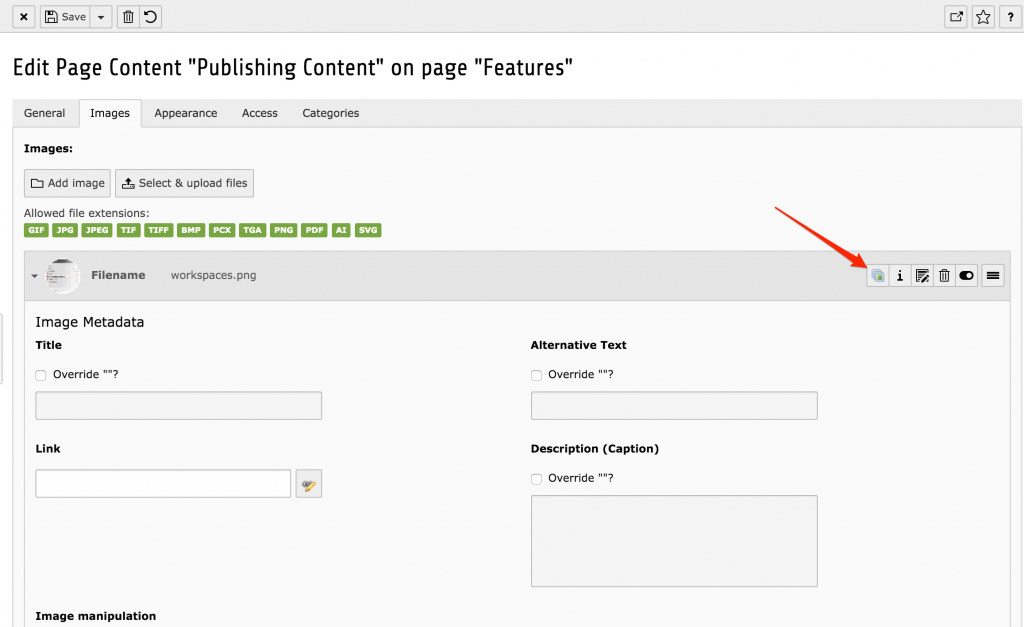
But for TYPO3 you are not bound to external tools and helpers! Luckily there is already a TYPO3 extension „focuspoint“, which provides the javascript and the helper tool integrated in the TYPO3 backend. The helper tool is available directly in the content element and via the file list. With this it is really really easy to set and save the focalpoint of an image.

If you are capable of understanding the german, the author Tim Lochmüller (@360friends) made a short video explaining the installation and configuration of the extension. It’s available on Youtube:
Conclusion
You see: there are several solutions availiable in the wild to provide the website visitors a unique and performant user experience. Additionally all of them are quite easy to implement. As all of them can be implemented in existing projects, there is no obstacle any more to use one these. Just go ahead and do not prevent your users from having a better and more comfortable surfing on your websites.


The standard TYPO3 srcset layout misses the ‘sizes’ attribute, that is mandatory to work correctly.
Fantastic, You have been written in every aspect of technical detail – Thanks!
Important topic – well documented. +1 solution I just learned of. Thank you!
How would the focuspoint extension work for responsiveness ? You still need a src-set to deliver diff img-sizes for media-queries/breakpoints…